
Well, this exercise was quite an experience. I had so much trouble on something that is so simple. At first I was thinking to myself that this would be super simple because I have used the pen tool in the past and remember it being not too difficult. However, I was wrong.
After going through all of the readings about the pen tool, I felt like I was ready. I went onto Photoshop and got a golfer and decided to outline him. So I did. It was very simple to get the outline down. But then this is where I got stuck. I was having difficulty getting my object that I outlined to fill in and have it look like a silhouette. I was freaking out and wanted to throw my computer across the room.
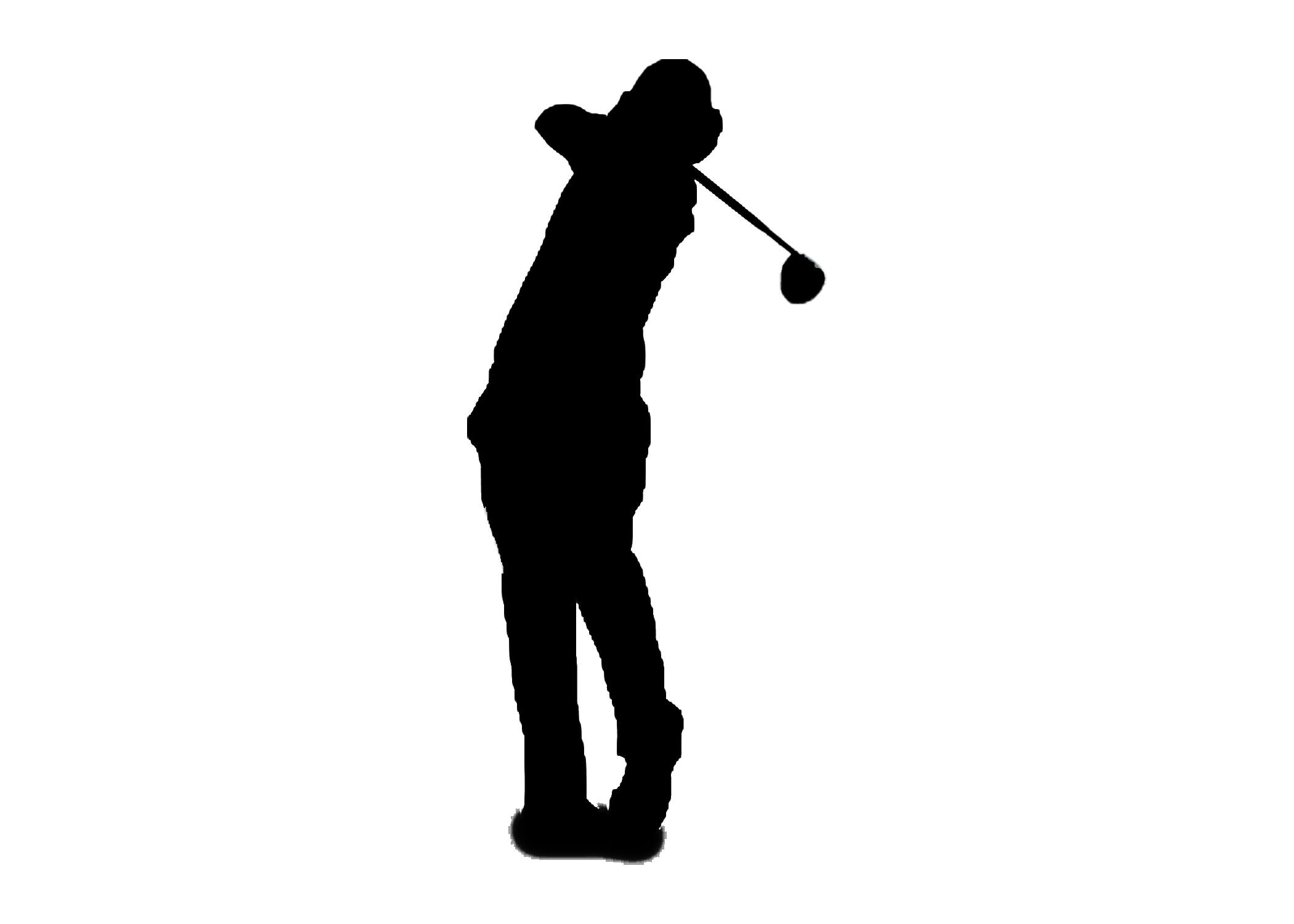
I watched a few videos and took a nap then came back to it. It was suddenly working for me and I was able to figure out how to make the silhouette. I took the golfer, Rory McIlroy, and went around him with the pen tool and was able to black him out.

Original Silhouette
New Silhouette
The other thing I decided to do was make myself famous without having to do anything! I took the cover of DJ Magazine, with Afrojack on the cover, and replaced his face with mine. I first used the pen tool to cut out Afrojack’s face, so that I could place mine in. I took an old picture of me and used the pen tool to cut out my face and paste it where Afrojacks was. Once I figured out how to use the pen tool again, these were quite easy to accomplish and will definitely come in handy for the future.

Original Magazine

New Magazine Cover


